
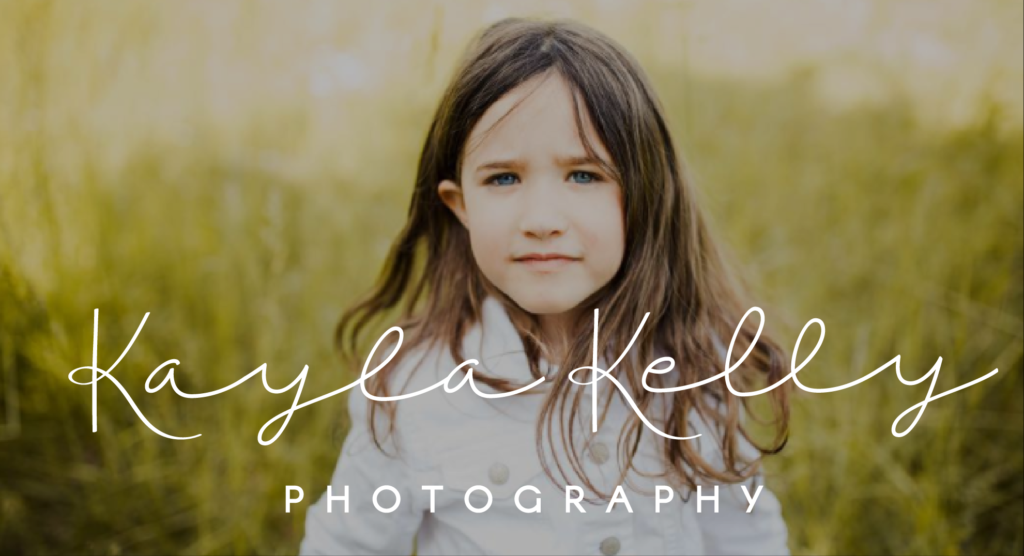
Kayla knew right away that she wanted her brand to be nature driven, blue-ish, and clean. She needed something that would allow her photography to shine while still adding character and identity to her presentation. Because I’m a typography nerd, I tend to begin the logo process by shopping for fonts. Script fonts are a hot item these days so there is no shortage of options, which makes my job a lot harder…but also more fun! The one we landed on was perfect, exactly what she had been imagining – except for one big problem: the K’s.

The capital one is lovely, although a little too grand for this project. The lowercase K was our last hope! But alas, it looks an awful lot like a lowercase R….and Kayla wasn’t too keen on rayla relly. So we had a problem to solve. I looked around for the perfect K in other fonts and found some that might have worked just fine, but ultimately ended up creating my own. The result is a completely customized wordmark, unique to Kayla Kelly Photography and tailored to fit her specific logo needs.
![]()
One of the other challenges we faced was creating a symbol that paid homage to Chelan yet didn’t box her in to a single geographical area. Anyone who has met Kayla knows of her affinity for adventuring in the mountains, so I started with that concept and ended up seeing it all the way through without needing to experiment with anything else.

This project has turned out to be one of the most enjoyable branding experiences I’ve ever had. There were a couple key reasons for this, one being that Kayla was the easiest client EVER. She had a very clear vision and direction for her new business and had answers for every question I asked. This girl was ready to be in business! The other factor that made a huge difference in the ease of this process is that I happen to know Kayla very well. Being a fine artist, a photographer’s brand is very personal and often a direct reflection of themselves. Having a base knowledge of what makes Kayla tick allowed me to skip over some of the more arduous parts of branding and get right into the good stuff that I knew she would like.
![]()
It’s this kind of personal connection that we crave with our clients, and is a pillar we have built our brand on. We want to know the people, the souls behind the brand, so that the final product is a direct reflection of the deepest-seated hopes and dreams that began forming way back when the idea was just a passing thought.
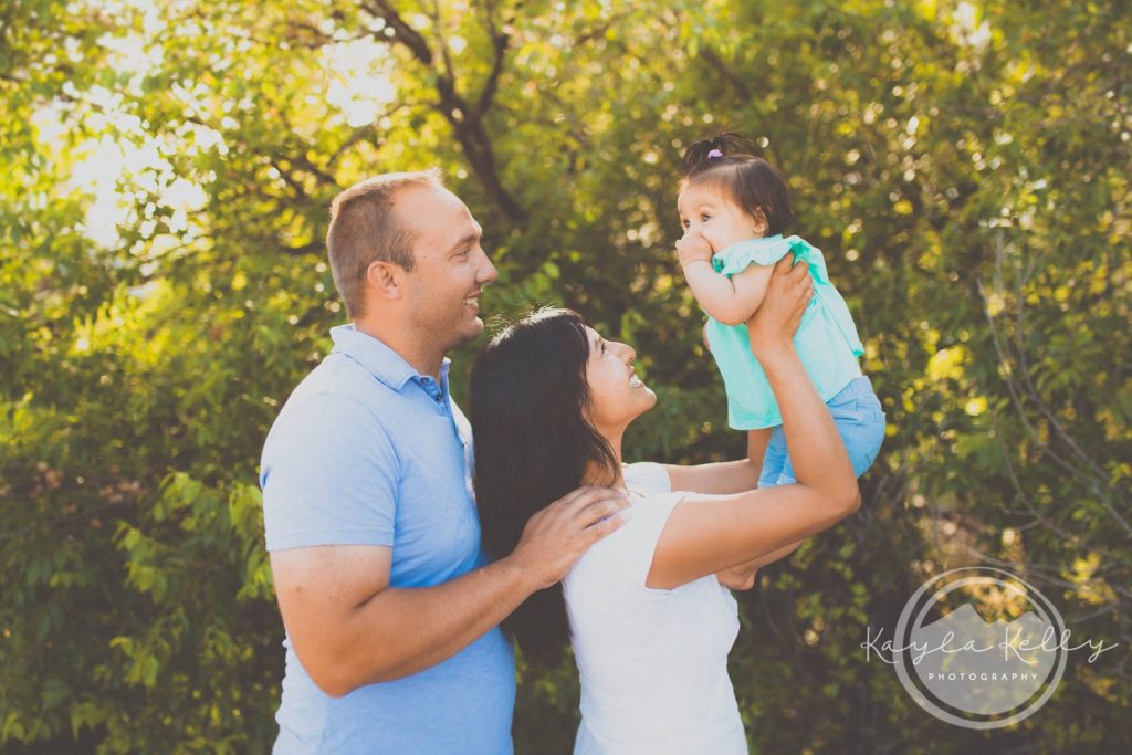
If you’re in need of someone to capture those special moments in life, Kayla is your girl. In fact, we have her to thank for the portraits on our front page. Be sure to check out her website to see how talented she is…and also witness her new logo in action!
![]()